Description:
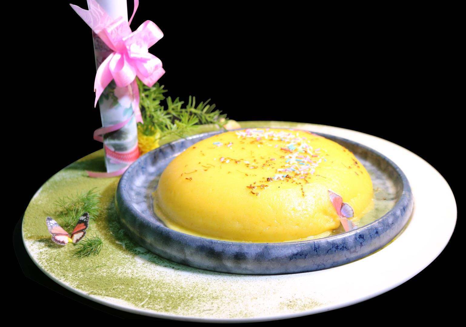
Sanbuzhan is a traditional Chinese dessert originating from Shandong Province. The name "Sanbuzhan" literally means "three non-stick" or "three don't stick," referring to its unique characteristic of not sticking to the pan, chopsticks, or teeth. The dessert is made from eggs, sugar, and starch, typically corn starch, and is fried into a golden-brown shape.
Tags:


Serving Size:
1~2 people.
Cooking time:
No need to prep. 15 minutes in total.
Ingredient:
5 pcs egg yolk, 50g sugar, 0.5g salt, 30g tapioca flour, 150g water, 20ml flower oil / corn oil.
Equipment Needed:
Stirring tool, Non-stick pan
Instructions:
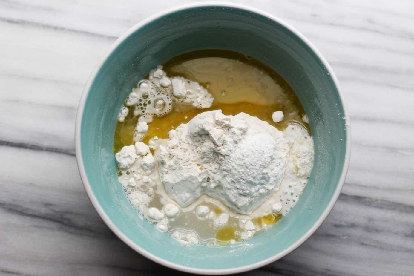
1)Mix the egg yolk with sugar and salt, then add in water and stir well.
2)Add in tapioca flour in 3 times, stir well.
3)Heat the non-stick pan at low heat, add in 10ml flower oil, add in (2) and keep stirring for 5 minutes. Then add in another 10ml flower oil, and stir it about 3-5 minutes.
4)Serve it warm and enjoy!
5) If you have leftovers, store them in an airtight container in the refrigerator, where they can usually keep for 2–3 days. You can reheat leftovers in a microwave or oven to restore some freshness.
Source:
Seiketsu's Chefs Sanbuzhan RecipeSample Imagery


Recipe Websites:
AllRecipesI love how AllRecipes is set up to make finding the perfect recipe super easy. The user reviews and ratings are really helpful in sorting through options, giving you an idea of how well a recipe works before trying it. The layout is straightforward, and the wide range of recipes makes it a great go-to for cooks at any level, with little extras like shopping lists making meal planning even simpler.
Simply RecipesThe clean, minimal design of Simply Recipes really allows the content to shine. The simple navigation and recipe categories are great for when you want to quickly find something based on what you have in the kitchen. I also like the total estimate time it provided, which allows you to have a rough idea of how long the dish takes to make.
Pinch of YumPinch of Yum’s aesthetic is fun and fresh, with beautiful, colorful food photography that draws you in. The recipes are presented in a way that feels approachable, with just the right balance of creativity and simplicity. One thing I don't appreciate is the lengthiness of the pictures it has on the web and it takes forever for me to scroll through to see the recipe.
Non-Recipe Websites:
MediumI really like how Medium keeps things clean and simple, with a focus on the written content. The wide white space around the articles helps break up the site and gives it a more open feel, making reading so much easier. The muted color palette is mostly white and black, which keeps things minimalist, but there’s just enough green and blue accents to guide your eye, making it feel modern without being overwhelming.
Simply ChocolateThe way Simply Chocolate uses large, bold product images in circular frames really makes the chocolates stand out. It adds a playful touch that breaks up the straight lines across the site, giving it a fresh and energetic feel. The overall design is mostly clean and minimalist, with a soft, neutral color scheme, but the colorful chocolate wrappers provide a fun pop that makes everything feel more dynamic and delicious.
Jeni'sI love how Jeni’s website feels as vibrant as their ice cream flavors. The playful use of bold colors and fun typography really livens up the page and makes it feel welcoming. The soft white backgrounds help the images of their ice cream pop, and little bursts of color here and there.